
Contents
Introduction
Scalable Vector Graphics (SVG) have become integral to modern web design, offering flexibility and adaptability across a myriad of devices and screen sizes. Understanding how to scale an SVG is a fundamental skill for designers, developers, and artists alike. In this in-depth guide, we will explore the intricacies of scaling SVG files, ensuring that your graphics maintain quality and clarity across various dimensions.
Unraveling SVG Fundamentals
Before we embark on the journey of scaling SVGs, let’s revisit the basics of SVG. SVG is an XML-based vector image format designed to be scalable without losing quality. Unlike raster images, SVGs use mathematical equations to define shapes, making them ideal for responsive design.
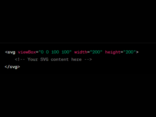
1. Use ViewBox Attribute
The `viewBox` attribute is a cornerstone for scaling SVGs. This attribute defines the coordinate system and aspect ratio of the viewBox in the SVG. When scaling, ensure the viewBox is appropriately set to encapsulate the content.
2. Scale with CSS
CSS provides a versatile approach to scaling SVG elements. The `transform` property can be employed to adjust the scale, offering flexibility in design.

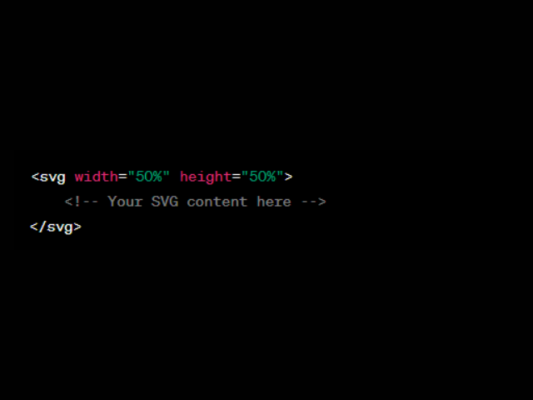
3. Responsive Scaling
Achieve responsiveness by setting the SVG width and height to percentages. This ensures the SVG adapts to its container size, facilitating a fluid and dynamic design.
Scaling with Precision
Now that we’ve covered the fundamentals, let’s explore advanced methods to scale SVGs with precision, ensuring optimal visual output.
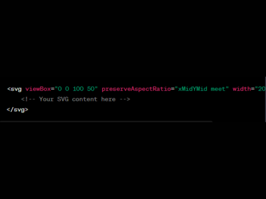
1. Maintaining Aspect Ratio
Distortion can be a concern when scaling. To maintain the aspect ratio, use the `preserveAspectRatio` attribute. This ensures that the original proportions are retained.
2. Scaling via JavaScript
For dynamic scaling or interactive applications, JavaScript comes to the rescue. The `getBBox()` method retrieves the bounding box, allowing for precise scaling calculations.

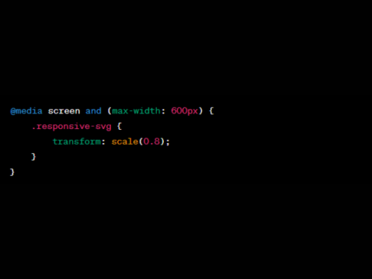
3. Incorporating Media Queries
Tailor your SVG scaling based on device characteristics using media queries in your CSS. This ensures optimal viewing experiences across different screen sizes.
The Art of Scalability
Mastering the art of scalability empowers designers and developers to create visually stunning and adaptable SVGs. Whether you are aiming for precision, responsiveness, or dynamic scaling, understanding the intricacies of SVG scaling is key.
1. Precision and Aspect Ratio
Precision in scaling goes hand in hand with maintaining the aspect ratio. This not only prevents visual distortion but also ensures a harmonious and consistent presentation of your graphics across diverse platforms.
2. Dynamic Scalability
JavaScript adds a dynamic dimension to SVG scaling. By dynamically adjusting the SVG attributes through scripting, you can create interactive and responsive user experiences, where the graphics seamlessly adapt to user interactions.
3. Responsive Design
In the era of multi-device usage, responsive design is non-negotiable. Leveraging SVG’s inherent scalability, combined with CSS media queries, allows designers to create layouts that respond gracefully to various screen sizes, from desktops to mobile devices.
Conclusion
Scaling SVGs is an art that requires a blend of technical know-how and creative finesse. By mastering techniques such as using the `viewBox` attribute, CSS scaling, and precision-oriented methods like JavaScript dynamic scaling, you can ensure your SVGs shine across various platforms and devices. Remember to prioritize aspect ratio, leverage JavaScript for dynamic scaling, and employ media queries for responsive designs. With these insights, you’re well-equipped to navigate the intricacies of scaling SVGs with precision and finesse, ultimately enhancing the visual appeal and adaptability of your vector graphics.
Related Posts


